The tiny kitchen was made into a walk-through area, and a cozy bedroom was installed in the niche – we’ll tell you about all the features of the project .
Designer transformed an apartment in an unusual old building built in 1949 beyond recognition. At the same time, they spent a little money on repairs. We tell you how our heroine managed to create functional housing for her family and not go over budget.
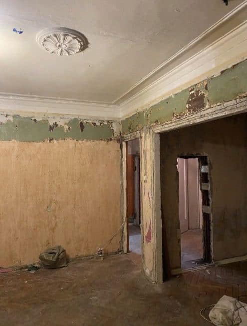
The two-room apartment is located in an unusual St. Petersburg Stalinist building built in 1949 – a two-story mansion that was built by captured Germans after the end of World War II. We bought the apartment with a “grandmother’s” renovation, so we had to redo everything. The entire renovation cost just over 1.5 million rubles, all thanks to some budget solutions. At the same time, the stucco molding in the apartment was preserved, the parquet flooring was restored, and the layout was made more convenient for our family.


The total area of the apartment is 46 square meters. Initially there were two rooms and a tiny kitchen. But we decided to do a redevelopment: we blocked the entrance to the living room from the hallway and made an entrance from the kitchen. As a result, the kitchen became a walk-through space, storage systems were organized in the living room and hallway, and the two-room apartment was practically turned into three-room apartments.
The kitchen is small – 5.4 sq. m. Initially, it was separate, but it would have been extremely inconvenient to place a dining area and cook comfortably on it. Therefore, we decided to combine the kitchen with the living room – with this layout we were able to organize more storage spaces and move the dining area to the living room bay window.
The kitchen turned out to be a walk-through kitchen, so we had to give up gas. To install an electric oven and stove, we purchased additional kilowatts for the house and went through a complex approval procedure.
The apron features large-format porcelain tiles with a terrazzo look. The same one was placed on the floor of the kitchen and hallway. This technique helped not to visually split up a small space with different types of finishes. The apron was deliberately not completed to the end of the work surface – I didn’t want it to stick out too much. Even though the sink is located close to the corner and splashes fall on the wall, there are no problems with cleaning – the walls have washable paint.

The kitchen set is quite budget-friendly, from a local St. Petersburg manufacturer. A tabletop made of laminated chipboard in film is a very practical option. In the corner near the window there was an inconvenient niche that was used for columns with equipment. This solution helped hide differences in the wall and provide additional storage cabinets. But, unfortunately, it was not possible to place two identical columns at 60 cm. As a result, we made one standard column for the built-in refrigerator, and the second one was narrower – there was a 45 cm oven and a shelf for the microwave.

We created a coffee corner on the windowsill: we installed a coffee machine and hung a shelf for coffee capsules on the window slope – it turned out very convenient.


From the kitchen area you enter the living-dining room. The area of this room is 16.8 square meters. m. In the bay window there is a dining area with a round dining table and soft chairs. The table was chosen to be round so as not to clutter up the space and allow for a fairly wide circular path.
The old oak parquet, laid in English herringbone, was preserved – it has been here since the house was built. Replacing it with a new one would entail huge costs for preparing the base, since the parquet does not lie on a flat slab, but on joists. The parquet was scraped off, and the large gap between the parquet and the wall was covered with a plinth.


In the corner of the living-dining room there is a small library with a bookcase and space for a guitar. Opposite is a rack with records and equipment. And in order for it to fit in this corner, the door to the main bathroom had to be greatly narrowed to the minimum possible size – the door was 50 cm.

By the way, the height of our interior doors is also non-standard – 210 cm, although the default was 2 meters. This replacement entailed additional costs, but it was very important: the height of the doors now matches the height of the openings to the kitchen and the alcove bedroom.
In place of the passage that was blocked, they installed a corner wardrobe for storing clothes. We chose it in white so that it would visually dissolve in space. There was still room at the end for a shelving unit – the perfect place to store our large record collection.

A compact workspace was created in the space between the closet and the passage to the kitchen. We didn’t forget about several lighting scenarios: a chandelier for general light, and pendant lamps above the dining table.

Thanks to the redevelopment in the living room, it was possible to create a conditionally third room – a bedroom in a niche. It took up only 4.5 square meters. m, but this was just enough to accommodate a large bed with a lifting mechanism. The bed has a soft headboard on both sides, so it can also be used comfortably as a sofa while watching TV.

Between the bed and the wall we placed a narrow storage cabinet, which was made to order. We store textiles for the bed in the inner drawers; it’s convenient to put cosmetics and a phone on the tabletop. They abandoned the overhead lighting – we didn’t need it. Instead, they provided two sconces above the bed.
Instead of the loft partition that was originally planned to be installed, curtains were hung. They cope with their zoning task, plus it saved the budget and added coziness to the space.

Two daughters live in the nursery. Since the area of the room is slightly more than 9 square meters, the only convenient solution was a bunk bed. The model was taken with a ladder, where each step is also a storage place.

The workplace was made as spacious as possible. To do this, we took a tabletop from wall to wall and screwed the legs to it. A storage area with two closets was placed next to the work desk – it was very important to provide a closet for each daughter. By the way, the cabinets are from IKEA, the facades were simply repainted in more suitable shades.

